 International Futures at the Pardee Center
International Futures Help System
Mortality Display: J-Curve
The Mortality Display: J-Curve sub-option is located under the Specialized Displays for Issues option, located in turn under Display from the main IFs screen.
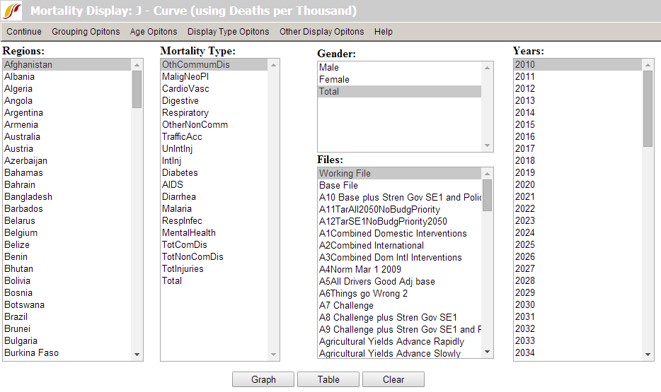
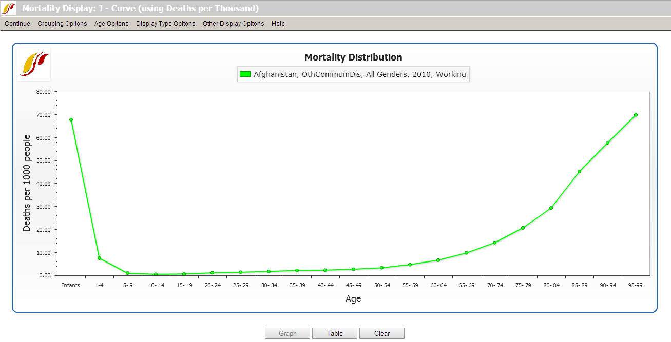
The J-Curve (see below) refers to the shape that a graph of mortality by age has when age is display on the X-axis (click on the Graph button at the bottom of the form to see this; click Clear at the bottom of the graph or Continue from its menu to return to the form itself). The form allows the user to view the age-specific distribution of types of mortality across various dimensions, which include mortality cause, geography, gender, year, and scenario. When you touch the Graph or Table button at the bottom, the form combines the specifications in each of its list boxes to produce the display. If you wish to display more than one item from a list box, hold down the control key and select additional ones.
The Mortality Display: J-Curve form has a set of menu options at the top. The Continue option allows the user to return to the previous screen. Grouping Options allows the user to select the unit of country/region, group, decomposed group or g-list.
Age Options allow the user to include people aged over 100 years and/or infants, or to display only adults (considered as aged 25 to 100 years old). The last sub-option uses the more collapsed age categories of the Global Burden of Disease (GBD) project rather than the 5-year categories of IFs.
Display Type Options allow the user to focus the display on children or adults and also to change the definitional range of the adult category. It also allows display of either mortality probability or mortality rate. The mortality rate is the more common measure and is simply the deaths divided by population, expressed as deaths per thousand. The probability rate is the likelihood of a person of a given age, say 15-year olds, dying before an older age, say 65. Although probabilities are normally expressed on a scale from 0 to 1 or 0 to 100, it is also possible to scale them from 0 to 1000 as in this display.
Other Display Options allow the user to toggle between displaying deaths in real numbers as deaths in thousands, or as a ratio of deaths per thousand people.