 International Futures at the Pardee Center
International Futures Help System
Radial Graph
The Radial Graph is accessible through the options and sub-options of Flexible Displays (option Other Graphs/Radial) and Self-Managed Display (select the variables and geography, click on Go to Display and select Graph/Radial Chart).
As an illustration, create a radial chart that explores three dimensions of governance (security, capacity and inclusion). From the Flexible Displays screen, click the Governance category and select the display titled Governance Triangle Security Capacity Inclusion. For comparison, select a group of countries such as Iraq, Kenya, Venezuela and the United States. (After selecting the first country, hold down the Ctrl key, and then select the rest.) Set the year 2010 as the time horizon. Now click the Other Graphs button on the tool bar, and select Radial.
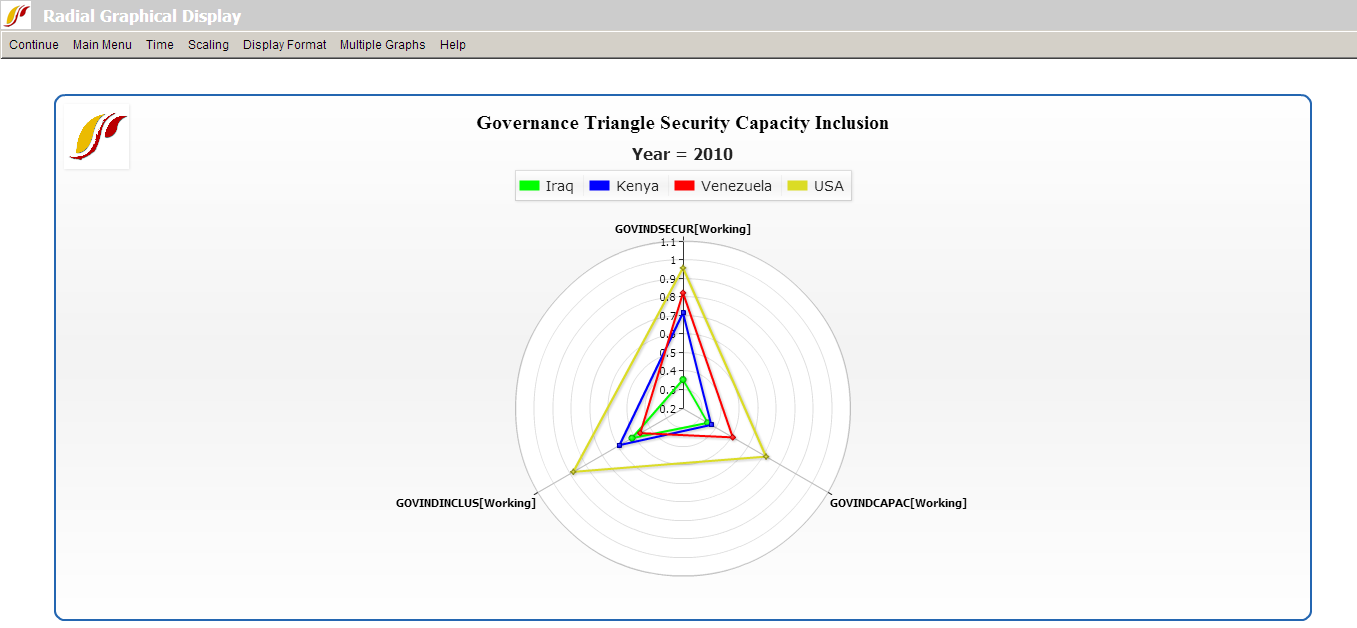
The single graph display as shown above enables users to make direct comparison among multiple countries. Each of the four countries is represented by a triangle, with one vertex for each variable, in this case, each dimension of governance. The farther from the center a point is, the higher its value is on the dimension represented by the vertex.
Options along the menu bar are similar to those featured on other graphical displays. The Multiple Graphs option, however, is unique to the radial diagram form. We will walk through the use of several sub-features under Multiple Graphs with an example.
To demonstrate, click Display from the IFs Main Menu, and select Self-Managed Display. From the Full Variable/Parameter Selection screen, first select a scenario- Markets First. Then, select AGDEM-Venezuela-All. Next, select a different scenario, say, Sustainability First. Next, select AGDEM-Venezuela-All. Now, click on Go to Display, and then Radial Chart under Graph. A graph like the one pictured below should appear.
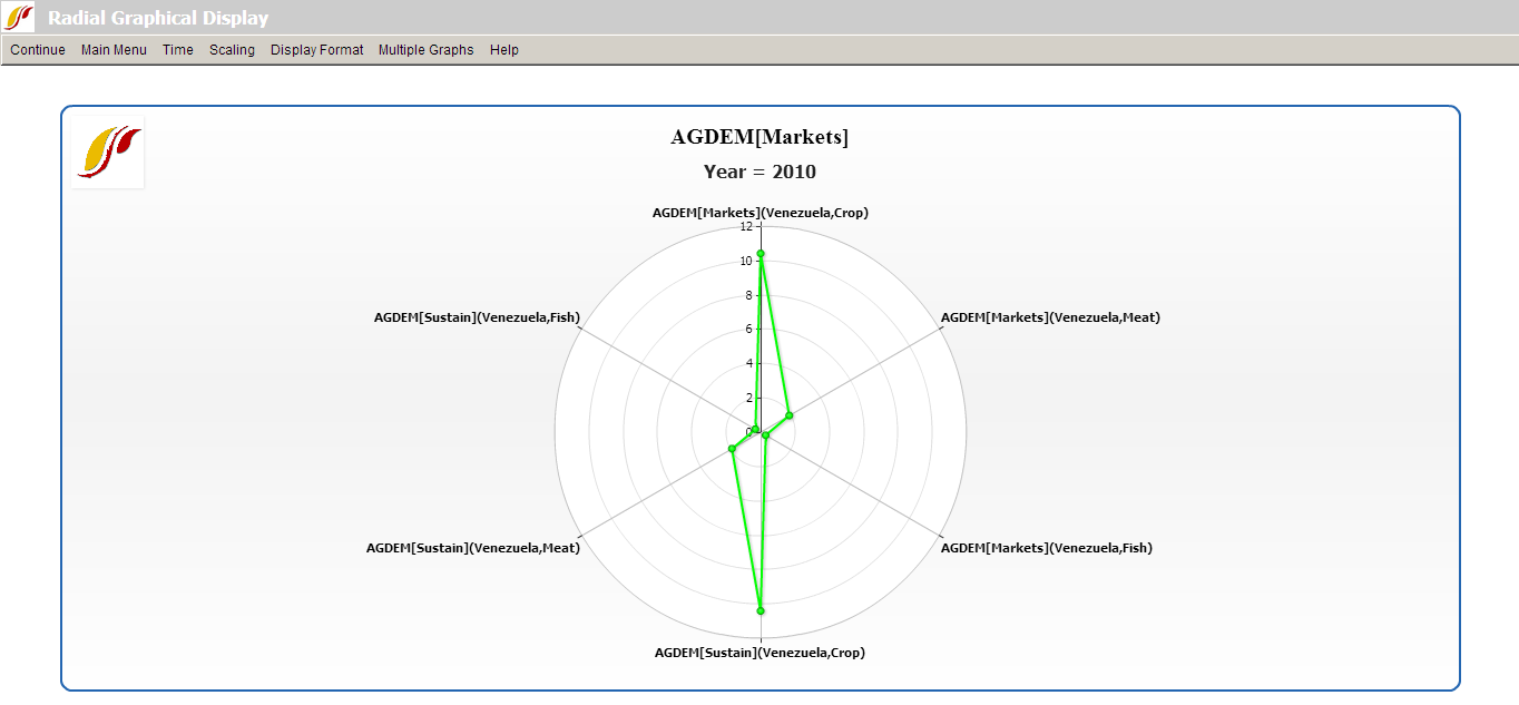
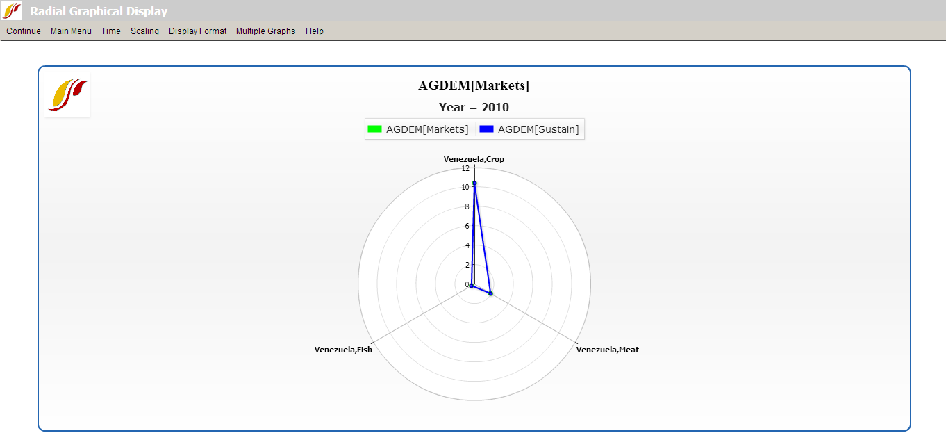
The first step is to adjust the number of variables displayed in the graph. The default number of variables displayed depends on the number selected. In this case, as we have six variables selected, six were identified in Self-Managed Display but there were really only three variables (each type of agricultural demand) times two scenarios. Set Multiple Graphs/Variables per Graph to three to generate the graph displayed below.
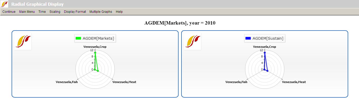
Next, click on Multiple Graphs/Display in Different Graphs. This option is useful when working with two or more years or scenarios, as the user can choose to display the different forecast years or scenarios in different graphs. To facilitate making comparisons, the user should consider turning on Common Scaling under the Scaling option. The following graphs should appear.
The next feature to experiment with is Multiple Graphs/Continuous Mode. This feature adjusts the manner in which variables are loaded in a radial graph. In the current example, the first items selected in Full Variable/Parameter Selection were the two different scenarios- Markets First and Sustainability First. When Continuous Mode is selected, these are the criteria by which the variables are grouped. With Discontinuous Mode selected (when Multiple Graphics/Continuous Mode is toggled off), the variables are interspersed between variables loaded in the even positions and variables loaded in the odd positions. To tell which variables are loaded in even and odd positions, simply return to the Display Menu and review the selected names. Similarly, if the variables were loaded according to country instead of by scenario, then using continuous mode would group the variables according to country. Note that selecting between continuous and discontinuous mode requires selecting an even number of variables.
The final feature to experiment with is Multiple Graphs/Display Multiple Years. As the name says, this option allows the user to display multiple years in a single graph. Hold down Ctrl when selecting multiple years. The various years are identifiable on the same graphic by different colors as indicated in the legend.