 International Futures at the Pardee Center
International Futures Help System
Line Graph, Bar Graph, Pie Chart and Scatter Plot
This general topic will go over the possibilities available to users when they access a graph.
There are several types of graphs available in IFs. These include Line Graphs, Bar Graphs, Pie Charts, Scatter Plots, and Radial Graphs. The use of Radial Graphs is discussed as another topic. Depending on whether you are accessing graphics to display historical data or forecast data, different options will be available.
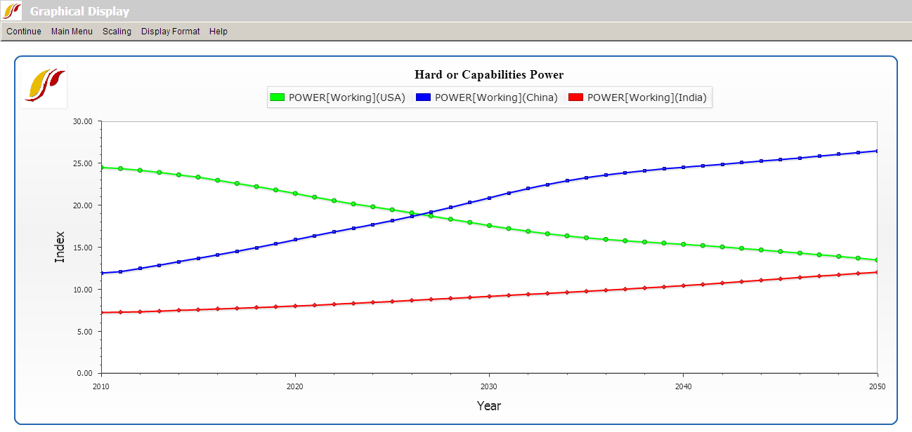
It is possible to generate graphics from various forms of IFs, including from tables. As an illustration of graphics from the Flexible Displays form, plot a line graph of a power index. From the form, select the Hard or Capabilities Power variable list under the Power category. For the geographic dimension select three countries, the United States, China and India. Set 2050 for the time horizon, and click the Line Graph button located on the bottom of the Flexible Displays screen to produce the graphic displayed below.
The display options at the top of the chart are typical for most graphs.
Continue: Use this to exit from the graphical display and return to the previous screen.
Main Menu: Selecting this option will bring users to the Main Menu of IFs.
Scaling (No Scaling and Common Scale sub-options): The default No Scaling option displays a traditional graph. The Common Scale sub-option scales the data points for each variable displayed so that the minimum value is zero and the maximum value is one. This option is useful for those who are simultaneously displaying multiple variables that differ greatly in scale, making changes over time in the variable(s) with smaller numbers very difficult to see.
Scaling (Index Base 1): This sub-option sets the initial year's value for each variable to 1 and displays the changes over time relative to that base value.
Display Format: This allows users to change the names in the legends, the titles of the graphs and generally customize the image for presentation purposes.
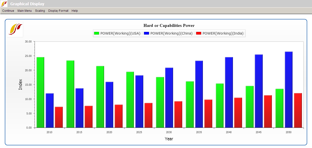
Continue back to form from which you generated the graphic (in our example to the Flexible Displays form) and change the display of hard power in the United States, China and India to a bar chart by selecting the Bar Graph option at the bottom of Flexible Displays. That will create the chart displayed below.
To display the same variable as a pie chart or a scatter plot, return to the Flexible Displays menu. The Other Graphs option on the menu bar will allow different types of displays.
The Pie Chart sub-option will display a pie chart (not shown here) for a specific year and the Time option in the menu will allow you to Advance or Regress time or to go to a specific year.
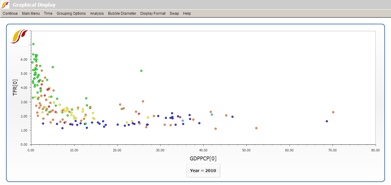
Use of the Scatter Plot sub-option of Other Graphs in Flexible Displays requires that you select two variables to plot against each other. To demonstrate, create a scatter plot of GDP per capita and total fertility rates. On the Flexible Displays screen, select two categories, Economy GDP per Capita and Population. (After selecting the first category, hold down the Ctrl key while selecting the second.) From the Displays field, select GDP per Capita at PPP and Fertility Rate in the same way you selected the two categories. For the geographic dimension, select all countries. Click the country on the top of the list, Afghanistan, hold down the Shift key, and click the last country, Zimbabwe. This will highlight all 186 countries in the field. As an alternative, set Geography Options to Decomposed Groups and select World. Leave the Horizon and Scenarios option as default, select Other Graphs, and click Scatter Plot to produce the graph displayed below.
Unlike other types of graphical displays, Scatter Plots have different options available at the top of the chart:
The Continue option allows users to return to the previous screen, and the Main Menu option will navigate users back to the Main Menu of IFs.
The Time option allows users to move forward (Advance) or backward (Regress) in time at 5 year intervals, or to displays data for any forecast year (Go To Year).
Grouping Options control geographic aggregation by only displaying members of a certain geographic list or group rather than all 186 countries.
Analysis (Relationships), only available when you are displaying all 186 countries, statistically fits different line types to the values plotted on the graph; these can represent linear, logarithmic, exponential, power, polynomial or logistic relationships. Analysis (Statistics) computes standard regression statistics for any kind of line chosen (linear by default).
Bubble Diameter adds a third dimension, either population or GDP, to the plot.
The Display Format option includes tools that customize titles, display intervals, run horizon, legends, etc.
Swap switches the x- and y-axes on the plot.