 International Futures at the Pardee Center
International Futures Help System
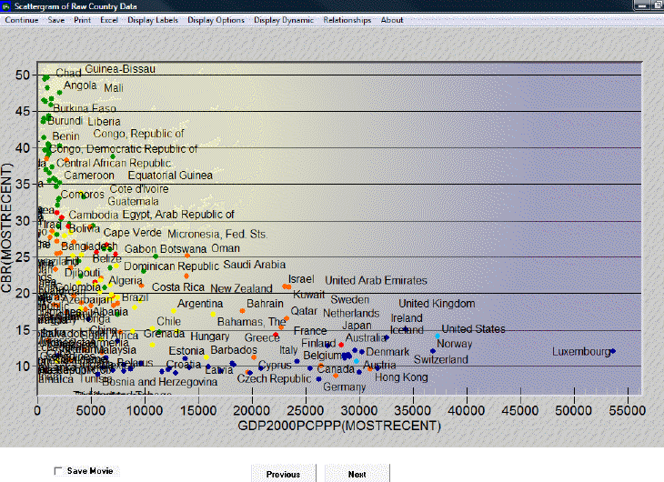
Analyze Across Countries - Scattergram
This section describes how to use the various features on the Scattergram, which appears after clicking the Plot button in the Analyze Across Countries (Cross-Sectional) option. The descriptions begin with the features found in the upper left-hand corner of the screen and ends with the features on the right of the screen.
Clicking on Continue returns the user to the previous menu, while clicking on Save provides options to save the data as a graph or as values.
The Excel option will export this data to an Excel spreadsheet.
The Display Labels feature allows the user to change the labels on the graph. The user can choose to display the full names of the countries or the abbreviations of the names. The user can change the labels of the x- and y-axes, the title, and the subtitle of the graph. The user can also choose to display certain data points and labels and not others by clicking on the Select Points and Labels option. After clicking on Select Points and Labels, a dialogue box appears with a list of all data points and corresponding labels. Next, after choosing which data and labels to display, click Save. The graph should now only display the selected labels and data points.
The Display Options feature allows the user to access various third dimension display options. One of these options is the Bubble Display feature, which displays the ’ of a given countrypopulation or Gross Domestic Product and facilitates comparison with other countries. This feature can be used to display either the dependent or one of the independent variables. Additionally, the user can change the geographic units that are displayed from Countries to Groups or Geographic Lists. Notice, however, that even when countries are displayed, they are colored according to regions. Click on Define Colors for G-Lists for a key to the various color-groupings. To change the color-grouping method, select a new region from the drop-down menu in the Define Colors option. Then click on Initialize Colors. The colors should now change according to the new grouping method.
The Display Dynamic option allows the user to create a movie of the interaction of these variables over time. There are two types of movies that the user can view: the first type traces the data points or the dots’ over time, while the second type simply shows the location of the various data points at a given point in time. To view a movie, first click on Display Dynamic and then select the Tracing Mode option. To label only certain or all years, click on Label Years. Click again on Display Dynamic, and then Show Movie, either with tracing on or off. Additionally, the user can display change through time by clicking on the Previous and Next buttons at the bottom of this display. Check Save Movie at the bottom of the screen to review the movie in the future. The movie will be saved under Stored Map Movie, which is located under Specialized Display.
The Relationships option allows the user to fit a line to the graph. To remove the line, click on No Regression.