 International Futures at the Pardee Center
International Futures Help System
Population by Age and Sex
The Population by Age and Sex option can be found from the Main Menu: choose the Display option, the Specialized Displays sub-option, and the Population by Age and Sex sub-sub-option. The option is also found in the Main Menu Map options.
That will bring up what demographers call an age-sex distribution of population, like the one below for Mexico in 2020. From this menu it is possible to display a population chart for any country/region or group of the globe. If you would like to display a country chart, click on Change Display and then Change Country/Region. A list will appear and you can scroll down to the country of your choice, in this case, Mexico.
In order to set the appropriate year, click on Advance to move the chart forward 5 years. Clicking on Regress will move the chart backwards 5 years. If you would like to display a chart based on a group, click on the Use Groups toggle, then click on the Change Display toggle and the Change Groups sub-option.
You can also display the numbers that were used to create this chart by clicking on the Show Numbers option. You also have the option of setting the year you would like to study by clicking on Change Display and then the sub-option Set Year.
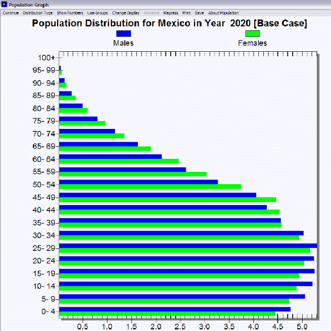
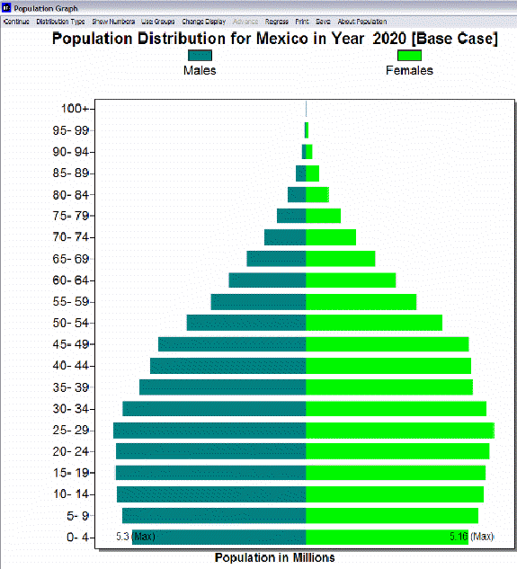
The above age distribution chart displays male and female population sizes for age cohorts separated into 5 year intervals. If you go to the Distribution Type option at the top of this chart and instead select Population Pyramid, you will have chart that also separates the population into sexes (males on the left, females on the right) and age cohorts in 5 year intervals. This chart (displayed below for Mexico in 2020) is a visual representation of population swells and shrinkages across time.
The Change Scenario sub-option under Change Display allows display of results from the base case or the working file. You will learn more about the working file and alternative scenarios in Lesson 2 and Lesson 3.
You can also produce fertility and mortality charts from this screen. Click on the Distribution Type option and then the Fertility sub-option. This will create a chart that shows at what age women are having children. By clicking on the Distribution Type option and the Mortality sub-option, you are presented with a chart that visually describes the ages that people are dying. Using the Advance option with the mortality distribution can help you understand both infant mortality trends and trends in life expectancy. Try two very different countries like Japan and Cambodia.
In the interest of transparency, IFs presents information about population data and equations that are used to determine these numbers.
Experiment with the options on the population graph. Try other countries/regions, display groups, and showing the numbers behind the graph. In particular, try Distribution Types, so that you can also look at fertility and mortality patterns.