 International Futures at the Pardee Center
International Futures Help System
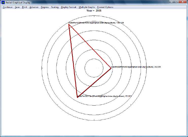
Radial Graph
The Radial Graph is accessible through the Flexible Display and Self-Managed Display options. Let's walk through the use of this feature.
The Continue button: Use this to exit out of the graph and return to the previous screen.
The Save option: This will save the image you have created as one of a variety of files. The image can also be exported to the clipboard for pasting in other applications. This option also allows users to specify the size of the file that they will be creating.
The Print option: Select this option, choose what printer you will send the file to and then OK.
Advance: Clicking this button advances the graph by 5 years to a maximum of 2100.
Regress: Clicking this button regresses the graph by 5 years to a minimum of 2005.
Scaling: This option uses the maximum and minimum values for each variable across all regions and time, producing values between 0 and 1. This feature is particularly useful in conjunction with the Display in Different Graphs option (see below).
The Display Format option: This allows users to change the names in the legends, the titles of the graphs and generally customize the image for export.
By double-clicking on the body of the graph, users are presented with a number of other display options. Users can change labels, colors, styles and much more through this option. This new window that is displayed by double-clicking on the body of the graph has its own help system that can be accessed by clicking on the Help button located at the bottom of the window.
Multiple Graphs: Several sub-options appear after clicking on this option. We will walk through the use of these various features with an example. In Full Variable/Parameter Selection, first select a scenario- try Markets First. Then, select AGDEM-Venezuela-All. Next, select a different scenario, say, Sustainability First. Next, select AGDEM-Venezuela-All. Go the Display, and then to Radial Graph.
The first step is to adjust the number of variables display in the graph. The default number of variables displayed depends on the number selected. In this case, as we have six variables selected, six are displayed. However, selecting more than six variables will nevertheless require the user to manually adjust the number of variables displayed, as the default does not automatically go higher than six. For the example here, change the Variables Per Graph to three. A graph like the one pictured below should appear.
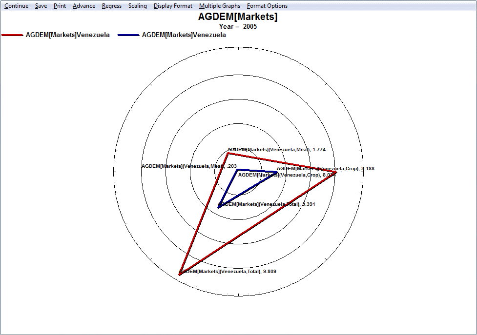
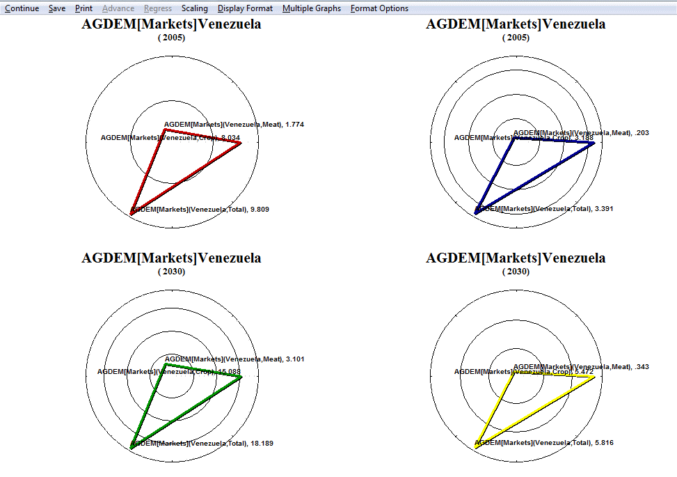
Next, click on Display in Different Graphs. This option is useful when working with two or more years or scenarios, as the user can choose to display the forecast or data for the years in different graphs. To facilitate making comparisons, the user should consider turning on Common Scaling under the Scaling option.
The next feature to experiment with is Continuous Mode. This feature involves adjust the manner in which variables are loaded in radial graph. In the current example, the first items selected in Full Variable/Parameter Selection were the two different scenarios- Markets First and Sustainability First. When Continuous Mode is selected, these are the criteria by which the variables are grouped. With Discontinuous Mode selected, the variables are interspersed between variables loaded in the even positions and variables loaded in the odd positions. To tell which variables are loaded in even and odd positions, simply return to the Display Menu and review the selected names. Similarly, if the variables were loaded according to country instead of by scenario, then using continuous mode would group the variables according to country. Note that selecting between continuous and discontinuous mode requires selecting an even number of variables.
The final feature to experiment with is Display Multiple Years. As the name says, this option allows the user to display multiple years in a single graph. Hold down Ctrl when selecting multiple years. The various years are identifiable by different colors corresponding to certain years. To keep with the current example, select 2005 and 2030. The following graphs should appear.
Format options: Double-clicking or right-clicking anywhere on the graph will bring up a dialogue box that has several display/formatting options.