 International Futures at the Pardee Center
International Futures Help System
Mortality Display: J-Curve
The Mortality Display: J-Curve option is located under the Specialized Display option, located in turn under Display from the main IFs screen. This option allows the user to view the distribution of types of mortality across various dimensions, which include grouping options, gender, years, and different scenarios. The J-Curve refers to the shape that most of the graphs have.
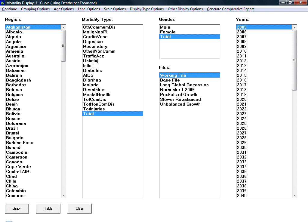
Upon clicking on Mortality Display, a dialogue box like the one above appears. The dialogue box features a row of options along the top of the screen, boxes with various variables that the user can select, and buttons along the bottom of the screen. The Continue button allows the user to return to the previous screen. The Grouping Options button allows the user to select the unit of country, region, group, or Glist. The Age Option allows the user to include people aged over 100 years and/or infants, to display only adults (considered as aged 25 to 100 years old).
The Label Options button is useful after the user has selected the dimensions to display on a graph. If the user has chosen to display two or more variables within a single dimension (i.e., multiple years as opposed to a single year), then, after clicking on the Graph button, the user is able to adjust how the lines are labeled. The different labels refer to the various dimensions of which the lines on the graph are composed- by region (1st dimension), mortality type (2nd dimension), gender (3rd dimension), year, and scenario.
The Scale options button allows the user to view the graph or table linearly or as a logarithm.
The Display Type option allows the user to choose to view data related to children or to all age groups.
The Other Display option allows the user to toggle between displaying deaths in real numbers, as deaths in thousands, or as a ratio, as deaths per thousand people.
The Generate Comparative Report will generate a report with data from the World Health Organization for comparison with forecasted data from IFs. This report has detail information on causes of death for every region of the world for which the organization has data.
Having picked the dimensions and navigated the options at the top of the screen, the user is now ready to generate a graph or table. The user can now click on Graph or Table to display the data.
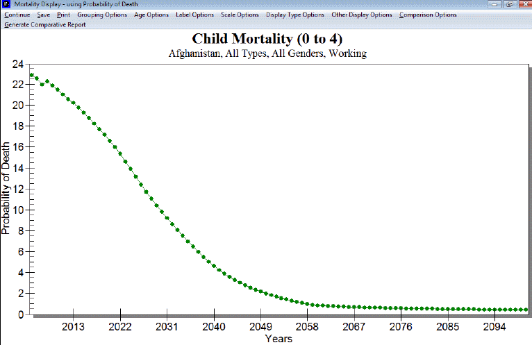
The options at the top of the new screen, titled Morality Distribution, are similar to those on the first screen displayed above, with the exception that the new screen has the options to save and print the graph or table. The user can alternate between viewing the data ar a graph or table. Clicking the Clear button returns the user to the mortality display screen.
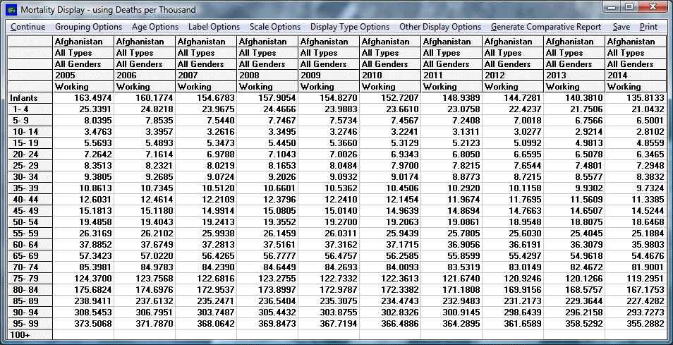
The table shown above is similar to the regular graph, but has features specific to Mortality Display. For instance, the user is able to exclude certain ages groups under the Age Options located at the top of the dialog box.