International Futures Help System
World Map, Lorenz Curve, Gini, Histogram
The World Map, Lorenz Curve, Gini sub-sub-option can be reached from the Display option on the Main Menu, the Specialized Display sub-option and then the World Map, Lorenz Curve, Gini sub-sub-option.

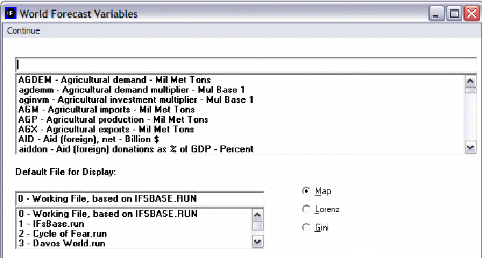
The main screen of World Map, Lorenz Curve, Gini allows users to select from a list of variable, choose which Run-Result-Files they would like to display these variables as, and then decide whether they would like to see the results as a map, a Lorenz curve or a Gini coefficient.
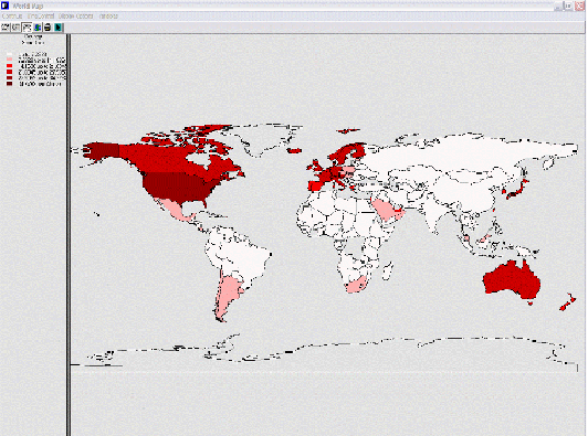
From the list of variables, scroll down until you see the GDPPCP option. This will display GDP per capita at its PPP. When you click on this variable, you will be presented with a map.

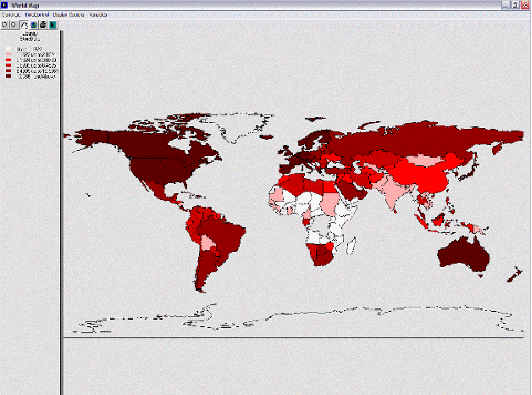
This map shows you GDP per capita at PPP for each country in the world where data is available. The reason that so many countries are not displayed by a color is because the default view of the map presents results in equal intervals. This means that the difference between GDP per capita at PPP from the richest and poorest countries is separated into 6 different equal intervals. This map shows you how many countries fall at the bottom of the GDP per capita at PPP spectrum. If you would like to display your results with an equal number of countries in each breakdown of the data, you have to click on Display Options and then the Equal Count sub-option. You will be presented with a graph that displays the results differently.

Experiment with the different options on the World Map feature of Specialized Displays. From the Main Menu of the World Map screen, you are able to change the year that is presented, the kind of map you are seeing or the variables that are displayed.
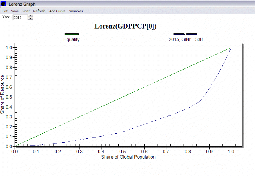
Another option on the Main Menu of World Map, Lorenz Curve, Gini leads to a display form called a Lorenz curve. Lorenz curves and Gini indices are standard measures of distribution of any variable across any population. Lorenz curves show the portion of the variable being examined (such as GDP) that accrues to different portions of the population (such as the world population). Reading across the bottom of the curve one can see the portions of the population, beginning with those that receive/control the smallest portion of the variable. Thus a 0.1 portion of the population (10%) will normally receive considerably less than a 0.1 (10%) share of the resource. And a 0.5 portion will receive less than 50%. But as one moves across the graph, ultimately a 1.0 (100%) portion of the population will receive or control 100%.
It is theoretically possible that the "poorest" 10% of the population could obtain a 10% share, that the "poorest" 50% portion could obtain 50%, and so on. If so, the Lorenz curve would be equivalent to the diagonal line that rises from the lower left to the upper right. That line is called the "Line of Equality," and it is almost an invariant rule that the actual Lorenz curve will fall well below it. The area between the Line of Equality and the actual Lorenz curve is the area of inequality.
Display a Lorenz curve. From the Main Menu of the World Map, Lorenz Curve, Gini sub-option of Specialized Displays, choose the same variable you displayed in the World Map: GDP per capita at PPP or GDPPCP. Make sure the Lorenz option is selected and then double click on GDPPCP. Choose a year to display.

The Lorenz curve window has several options. You can add curves from more than one year so that you can see the forecast of changing inequality over time. You can also save or print the graphical image. Note that the Gini index is calculated and displayed for each curve on the graphic, as well as being available as a separate measure across all time periods.
The Gini index is calculated as the area of inequality divided by the entire area under the Line of Equality. Thus larger numbers indicate greater inequality. For most economic distributions value of Gini will fall between 0.2 (quite high equality or low inequality) and 0.8 (very high inequality).
 International Futures at the Pardee Center