 International Futures at the Pardee Center
International Futures Help System
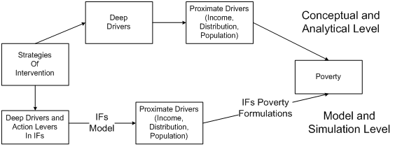
The Proximate Drivers of Poverty
Knowledge of two drivers allows quite accurate calculation of the portion of a population living at or below any specified poverty level: the average income of the population and the distribution of that income. Once the rate of poverty is known, it requires only knowledge of a third driver, population size, to know also the number of people living below that poverty level. In dynamic societies there are, of course, a huge number of deeper or more distal drivers that affect these proximate drivers (literally anything that affects economic growth, the nature of income distribution, and the population size). The figure below shows this conceptual understanding of poverty, and indicates that the IFs system formalizes that understanding by calculating poverty from the three proximate drivers and also calculates those proximate drivers from the much larger forecasting system (the economic, population, and other models of IFs). Moreover, the IFs system makes available large numbers of intervention points for developing alternative scenarios around poverty futures.
Other parts of the documentation of IFs describe the determination of population and economic growth and of the calculation of the Gini coefficient (GINIDOM) as the key representation within IFs of income distribution. That documentation describes how the Gini coefficient is based on the Lorenz curve and how the Lorenz curve in IFs is tied to forecasting of the income shares of unskilled and skill households and the shares of population in those two household types.
The Lorenz curve of IFs with only two income categories is, however, an unsatisfactory form for representing the income distribution of the societies we forecast. It is both “non-parametric” in the sense that no simply analytical form can describe it for the purposes of our forecasting and it is crude in the representation of just the two income types. What we want for poverty forecasting is an analytical form and one that can capture more smoothly the increasing income shares that richer portions of the population will have. (Ideally we would also want a representation from which we can conveniently compute specific deciles or quintiles.)
The most widely used parametric representation in poverty analysis is the lognormal density. A density curve captures the percentage of the population that earns or consumes a given amount (unlike a distribution that captures the cumulative percentage of population that earns or consumes up to a given amount). Although income and consumption are not exactly distributed in a lognormal form for every country, it is a very good approximation to observed empirical distributions for most (it will obviously not be such a good form for a country like post-Apartheid South Africa that has something closer to a binormal distribution). As Bourguignon (2003: 7) notes, a lognormal distribution is “a standard approximation of empirical distributions in the applied literature.” A variable is lognormally distributed if the natural logarithm of that variable is normally distributed, as in the well-known “bell curve.” See the figure below a lognormal density curve.
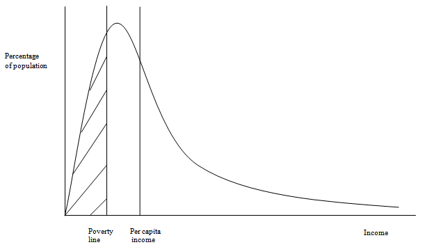
One advantage of using a lognormal density to capture the distribution of income in a society is that it can be fully specified with only two parameters, average income and the standard deviation of it. More useful for our purposes, the Gini coefficient can be used in lieu of the standard deviation. See Appendix 2 of Hughes et al. (2009) for the explanation of that relationship and for much more information on the use of the lognormal distribution in IFs, including the calculations of poverty rates and poverty gaps, and the reconciliation of analysis using national accounts and survey data.
The figure above provides an illustration of how to obtain the poverty headcount from a lognormal density curve. For a specified poverty line—for example, the one corresponding to dollar a day—the area to the left of the line gives the poverty headcount ratio. The first vertical line in the figure shows the poverty line, and hatched lines show the area corresponding to the headcount ratio. The poverty headcount number is the headcount ratio times population.
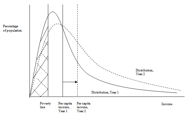
The figure below similarly illustrates how changes in income distribution and the average level of per capita income can affect the poverty rate and therefore number. In this figure, the second vertical line from the left shows the income level for a given point in time, say Year 1, while the solid curve shows the income distribution. The third and dashed vertical line shows the income for a subsequent time, say Year 2,while the dashed curve shows an associated income distribution. The area of hatched, dashed lines to the left of the poverty line in the new distribution shows the new poverty headcount ratio. This area is smaller than the area under the Year 1 distribution, and the poverty headcount ratio has decreased. What happens to the poverty headcount number depends on the how the population has changed between the two years. If the population increases significantly, the headcount number can increase even if the headcount ratio decreases.
What is the evidence on poverty changes arising from the interaction of growth and distributional effects? There is evidence that growth tends to be “distribution neutral” on average; Ravallion and Chen (1997), Ravallion (2001), Dollar and Kraay (2002), find a close to zero correlation between changes in inequality and economic growth. This is consistent with the evidence that the growth effect dominates and growth tends to reduce absolute poverty (World Bank 1990, 2000; Ravallion 1995; Ravallion and Chen 1997; Fields 2001, and Kraay 2004). World Bank (2001) and Ravallion (2004) suggest that the “elasticity” of the dollar-a-day poverty rate to growth is -2; an increase in the growth rate by 1% is associated with a decrease of 2% in the headcount index of poverty.
While there is general consensus that growth is good for poverty alleviation, a few voices of caution can be heard. The actual reduction in poverty is arguably lower than might be expected given recorded rates of economic growth. This has been termed “the paradox of persistent global poverty” (Cline 2004: 28). Poverty in the 1990s declined by less than would have been predicted with a poverty-growth elasticity of around -2. Khan and Weiss (2006) warn that the elasticity of poverty to growth can vary widely—only -0.7 for the Philippines compared to -2.0 for Thailand—depending on the initial inequality and changes in inequality over time. Ravallion (2004) lists a few reasons to be cautious about the finding of distribution neutrality of growth: measurement error in changes in inequality, possible churning under the surface with winners and losers at all income levels, and possible increases in absolute income disparities. Moreover, a few countries and regions could experience poverty increases from distributional changes, even if on average there is neutrality.
In addition to uncertainties introduced by income inequality effects, the elasticity approach to anticipating poverty decline with income suffers from another problem. A given rate of economic growth will have a bigger impact on poverty headcount when the poor are clustered closely around the poverty line than when their incomes fall markedly below the line. In some countries this phenomenon might explain the weaker than expected response of poverty levels to growth in the face of only modest changes in overall inequality.
The lognormal approach for forecasting poverty of IFs eliminates the need to use the elasticity approach. In fact, lognormal specifications could be used to calculate variable poverty elasticities across countries and time.