 International Futures at the Pardee Center
International Futures Help System
Estimating the Expected Levels of Infrastructure
At the core of our forecasts of the expected levels of infrastructure is a set of estimated equations embedded within a set of accounting relationships. The equations are presented here.
Additional elements beyond the estimated equations are involved in specifying the expected values of infrastructure, and we handle some of these elements algorithmically. For instance, the base year calculated estimations will most often not match exactly the historical data for countries in the base year.[1] Each country has peculiarities that differentiate it from the “typical pattern”; among the factors not captured by our equations for estimating the base year country values are many aspects of geography, culture, and unique historical development paths. And sometimes, of course, data errors account for such differences.
To deal with this issue of differences between our estimated values and reported data in the base year, the model calculates an additive or a multiplicative country and variable specific shift factor representing that difference; we allow those shift factors to gradually diminish over time, thereby causing countries to approach the expected value function. Among the reasons for allowing convergence is that we quite consistently see that the patterns of higher-income countries are more similar and more like those of our general equations than are those of lower-income countries. On the assumption that countries will seldom abandon infrastructure they have already developed, however, our downward convergence is extremely slow relative to our upward convergence.
A second instance in which we make adjustments to our core estimated equations is when the dynamic trajectory of demand/supply growth in a country in recent years is inconsistent with the forecasts produced by the equations. For instance, a policy-based surge of infrastructure development like that seen recently in China may result in a historical growth rate well above the one that our functions produce in the first years of our forecasting. Making a simplifying assumption that these growth rates will change only gradually, we estimate the growth rate of physical infrastructure stock using the historical data over three to five recent years and incorporate that growth rate in the demand estimation through a moving average-based extrapolative formulation.
We make a final adjustment in those cases where we wish to modify the estimates of expected infrastructure for scenario analysis. This can be accomplished in several ways. First, most of the estimates can be adjusted with the use of a simple multiplier. Second, we can stipulate specific levels for specific types of infrastructure in a specific future year; in this case, the model will automatically forecast a linear approach to the targeted level from the base year. Third, we can modify both the rates at which the country shift factors converge and the levels, in relation to the expected values, to which the shift factors converge. For example, we can drive the shift factors to those of the best performing countries, i.e., those that perform better than expected, by a certain date. This will, in turn, affect the levels to which the physical infrastructures themselves converge (see Standard Error Targeting).
Transportation
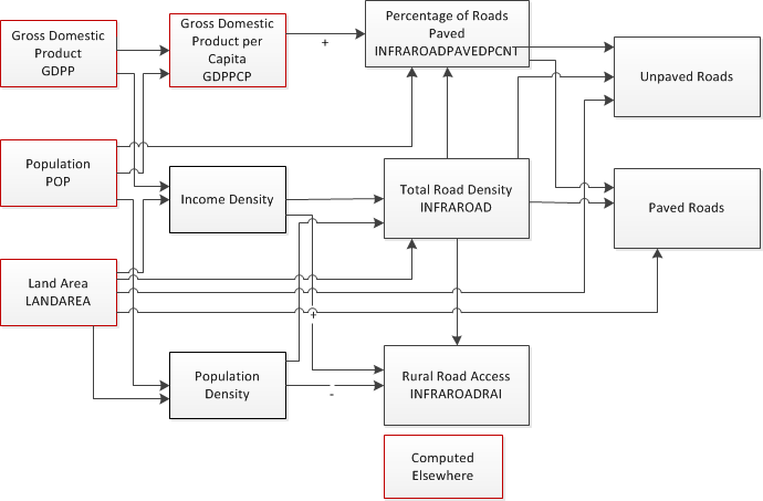
The primary indicators of transportation infrastructure included in IFs are: 1) the total road density in kilometers per 1000 hectares, INFRAROAD, 2) the percentage of roads that are paved, INFRAROADPAVEDPCNT, and 3) the Rural Access Index, INFRAROADRAI, the percentage of the rural population living within two kilometers of an all-season road. From these, we can calculate additional indicators, such as the expected lengths of paved and unpaved roads.The general sequence of calculations for estimating the expected values of these variables is shown in the figure below. We begin by estimating road density (INFRAROAD) as a function of income density, population density, and land area. The percentage of roads that are paved (INFRAROADPAVEDPCNT) is then calculated as a function of the estimated road density, GDP per capita (GDPPCP), population (POP), and land area (LANDAREA). In parallel, the Rural Access Index(INFRAROADRAI) is calculated as a function of the estimated road density (kilometers per person) and income density (dollars per hectare).
Electricity
Our focus in the energy sector is on the generation and use of electricity. In terms of physical infrastructure, the key indicator we forecast is the level of electricity generation capacity, INFRAELECGENCAP. From the user perspective, we forecast the percentage of the rural and urban populations that have access to electricity, INFRAELECACC(rural) and INFRAELECACC(urban). These access rates, in combination with the forecasts for population and average household size, are used to calculate the number of household connections, which drive the cost calculations described below. Finally, given its connection to electricity access, we also forecast the percentage of the population that uses solid fuels as the main source of energy, ENSOLFUEL. At the moment, no physical infrastructure is associated with solid fuels, so this value does not enter into the cost calculations.
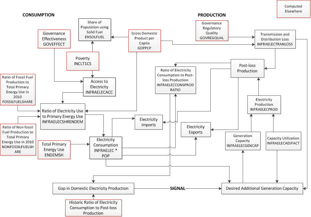
The following figure presents an overview of the submodel that forecasts access to electricity and electricity generation capacity in IFs. It is fully integrated with the larger IFs system, which provides forecasts of critical variables such as energy demand, energy production by primary type, poverty, and governance character. The electricity submodel contains three components—estimating consumption, estimating production, and sending a signal for additional generation capacity in the case of a gap between production and consumption.
Beginning with consumption, we first estimate the percentage of the population with access to electricity (INFRAELECACC). This is forecast as a function of poverty levels (INCOMELT1CS/POP) and a measure of government effectiveness (GOVEFFECT). The levels of access, along with average income (GDPPCP) determine the share of the population using Solid Fuel for heating and cooking (ENSOLFUEL). Next, the levels of access and average income (GDPPCP), along with the historic ratios of fossil fuel and non-fossil fuel production to total primary energy use (FossilFuelShare and NonFossilFuelShare), are used to forecast the expected ratio of electricity use to total primary energy use (INFRAELECSHRENDEM). With this ratio and the level of total primary energy use (ENDEMSH)[2], forecast elsewhere in IFs, we then calculate the desired electricity use (INFRAELEC * POP).
The amount of domestically produced electricity (INFRAELECPROD) is determined by the existing generation capacity (INFRAELECGENCAP), adjusted by a capacity utilization factor (INFRAELECTADJFACT). We estimate the initial capacity utilization factor for each country based on historical data related to generating capacity and electricity production. Over the forecast horizon, the capacity utilization factor is assumed to converge, over a 50 year period, to a global average value, 0.55, which we derived from current data on generation capacity and production in high-income countries. We also account for transmission and distribution loss (INFRAELECTRANLOSS), which we forecast as a function of average income (GDPPCP) and a measure of governance regulatory quality (GOVREGQUAL). This allows us to calculate post-loss production of electricity.
The desired electricity use can be met by either the domestic post-loss production or imports. Similarly, the post-loss production can be used for either domestic use or exports. At the moment, we assume that the imports are available, when necessary, and that any excess post-loss production can be exported; i.e., we do not attempt to balance the trade in electricity. In parallel, we use the ratio of desired electricity use to post-loss production (INFRAELECCONSPRODRATIO) as a driver of future levels of generating capacity. Each year the computed ratio is compared to a historical value calculated in the pre-processor. We make the simplifying assumption that countries wish to keep this ratio constant over time. A growing ratio implies that domestic consumption is increasing at a faster rate than domestic production, which sends a signal indicating a desire to build additional capacity. A declining ratio implies that domestic consumption is increasing at a slower rate than domestic production. While this could send a signal to remove existing capacity, the model does not do so; rather it calls for no new construction and less than full replacement of depreciated capacity. Over time, this should bring the production and use back into historical balance.
Water and Sanitation
Access to Water, Access to Sanitation, and Wastewater Treatment
The key access indicators we include for water and sanitation infrastructure are the percentages of the population with access to different levels of improved drinking water and sanitation and whose wastewater is collected and subsequently treated. The physical quantities include the number of connections providing these services and the amount of land that is equipped for irrigation.
We originally introduced forecasts of access to improved sources of drinking water and sanitation into IFs in support of the third volume in the PPHP series, Improving Global Health (Hughes, Kuhn, et al. 2011), because of the health risks associated with a lack of clean water and/or improved sanitation. We have extended this portion of the model to include forecasts of the share of wastewater that is collected and then treated prior to being returned to the environment. In addition, we have added a component to forecast the area equipped for irrigation.
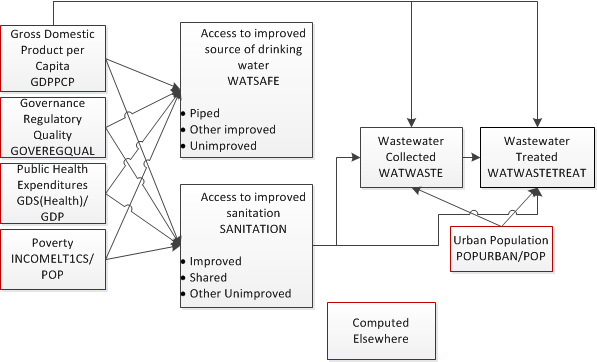
The WHO and UNICEF (2013) use the concept of “ladders” for drinking water sources and sanitation systems. They currently include four steps for both drinking water (surface water, unimproved, other improved, and piped on premises) and sanitation (open defecation, unimproved, shared, and improved). As countries develop, more of their citizens ascend these ladders. We have combined these into three categories each; for drinking water these are unimproved, other improved, and piped; for sanitation, these are other unimproved, shared, and improved. Notably, using international standards, estimates of the total population with access to improved sanitation does not include the shared category.
We forecast the shares of the population in each of the water and sanitation ladder categories using average income, poverty levels (measured as the percentage of the population living on less than $1.25 per day), educational attainment (measured as the average number of years of formal education for adults over 25), and public health expenditures as explanatory variables (see the next figure). These results then feed into the forecasts of the percentage of population with wastewater collection and wastewater treatment.
Finally, these access rates, in combination with the forecasts for population and average household size, are used to calculate the number of safe water, sanitation, and wastewater treatment connections, which drive the cost calculations described below.
Area Equipped for Irrigation
There have been few forecasts of the area equipped for irrigation, and those that do exist tend to be based on very detailed analyses of specific situations. In a recent report from the United Nations Food and Agriculture Organization (FAO) looking out to the year 2050, Bruinsma (2011: 251) stated that the “projections of irrigation presented in this section are based on scattered information about existing irrigation expansion plans in different countries, potentials for expansion (including water availability) and the need to increase crop production.” Another report looking at global agriculture over the next half century (Nelson et al. 2010), this one from the International Food Policy Research Institute, relies on exogenous assumptions of the growth in irrigated area. The authors do not specify the source of these assumptions, but some of the same authors (You et al. 2011) have reported on the irrigation potential for Africa, basing their conclusions on agronomic, hydrological, and economic factors.
Rather than attempt to replicate the level of detailed analysis of most previous studies, we forecast the area equipped for irrigation based on data from the FAO’s FAOSTAT and AQUASTAT databases on historical irrigation patterns and the area that could potentially be equipped for irrigation. These data are incomplete; for area equipped for irrigation, data are provided for 168 of the 186 countries included in IFs, and for the potentially irrigable area, data are provided for 117 of 186 countries. In our examination of these historical data, we found that a number of countries had already reached an apparent plateau in the amount of area equipped for irrigation that was often well below the potential indicated. For example, Argentina’s equipped area has stayed at a bit over 1.5 million hectares since the late 1970s, even though its potential is given as more than 6 million hectares. Why a country saturates below its ultimate potential is often unclear, but one obvious reason for some countries is that they receive enough rainfall to not warrant further irrigation.
In any case, once we have determined an appropriate saturation level for each country and a recent historical growth rate, we assume that the expected area equipped for irrigation gradually approaches the saturation level. The rate of growth starts at the historical growth rate, with the growth rate slowing as the saturation level is approached. The user can modify this path using the parameter ladirareaequipm , which acts as a multiplier. Still, the amount of area equipped for irrigation cannot exceed the specified saturation level for the country.
ICT
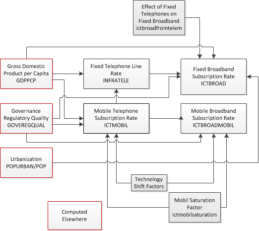
We forecast four basic indicators of ICT infrastructure: fixed telephone lines, fixed broadband subscriptions, mobile telephone subscriptions, and mobile broadband subscriptions, all per 100 persons. Our forecasts for the expected levels of these different forms of ICT infrastructure are driven in part by cross-sectional relationships with average income and government regulatory quality. As the next figure illustrates, however, there are also interactions among the different forms of ICT.
For each technology, we found strong relationships indicating that usage levels (our proxies in this case for access) increase with rises in average income and governance regulatory quality; in the case of fixed broadband, we also found urbanization to be important, as one might expect for a technology whose installation is supported by population density.
As for the interactions between the different forms of ICT, we start with fixed telephone lines. Given the potential for substitution by mobile telephone lines, we assume that the demand for fixed telephone lines will decline as mobile usage increases. Already we see this happening in the data, especially, but not exclusively, in high-income countries. Our analysis of the historical data indicates a level of approximately 30 mobile telephone subscriptions per 100 persons as the point at which fixed-line telephone decline begins, so we build this into our forecasts algorithmically. We do not expect that fixed telephone line usage will completely disappear. Rather, we assume arbitrarily that it will settle at a low level; this is set by default to 2.5 lines per 100 persons. Furthermore, we also assume that: (1) mobile broadband subscriptions will never exceed mobile telephone subscriptions; and (2) any decline in fixed telephone lines will boost the growth in fixed broadband because countries that have existing investments in fixed-line infrastructure are able to leverage these networks to provide broadband access with rather modest investments.
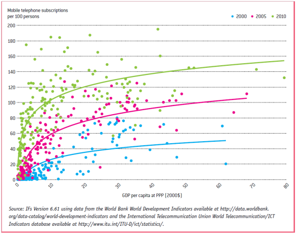
The cross-sectional relationships with income do not remain static across time for mobile phones, fixed broadband, and mobile broadband. The last figure shows this for mobile telephone subscriptions. The individual points reflect historical data for country access rates for the years 2000, 2005, and 2010. The lines are logarithmic curves fit through these data. The upward shift over time reflects advances in information and communication technologies that are making ICT cheaper and more accessible around the world. These advances are, in turn, driven by various systemic factors ranging from product and process innovation to network effects.
In order to capture the effect of this rapid change in our forecasts of future access, we combine the use of the cross-sectional function with an algorithmic approach that simulates the upward shift of the curves for mobile phones, fixed broadband, and mobile broadband. The algorithmic element assumes a standard technology diffusion process in which the growth in penetration rate associated with the technological shift rises from a low annual percentage point increase at low levels of penetration to a maximum at the middle of the range (the inflection point) and falls again as saturation is approached. For each of the three technologies, we have looked at historical patterns to estimate the minimum and maximum growth rates, expressed as annual percentage points of absolute change.
The choice of saturation levels is obviously quite important. Data from the International Telecommunications Union show penetration rates for mobile phones that exceed 100 subscriptions per 100 persons (e.g., approaching 200 in Hong Kong). At the same time, some countries (e.g., Denmark) seem to be reaching a saturation level for fixed broadband well below 100 subscriptions per 100 persons. Uncertainty remains over the proper level of saturation to assume for these subscriptions, and therefore, different researchers use different values. Specifically, we define saturation as 50 subscriptions per 100 persons for fixed broadband and 150 subscriptions per 100 persons for both mobile technologies. In addition, we assume that mobile broadband penetration cannot exceed mobile phone penetration.
Similarly to the other access rates, the numbers of lines and subscriptions per 100 persons, in combination with the forecasts for population, are used to calculate the absolute number of lines and subscriptions, which drive the cost calculations described below.
[1] Not all countries have data for all indicators included in the model in the base year. IFs includes a preprocessor that uses a series of algorithms that draw on historical data for previous years, the estimated equations, and other factors to initialize these missing data.
[2] ENDEMSH is an adjusted value of ENDEM, which takes into account the differences between the base year values for total primary energy use from historic data and the base year values calculated in the pre-processor, which adjusts for differences between the physical and financial data on energy trade. The ratio of ENDEMSH to ENDEM gradually converges to 1 over a number of years given by the parameter enconv .